Ranking All of the Reverse Retro Jerseys
The NHL has spent the last week teasing their new Reverse Retro theme around the league, and with them finally being unveiled today, the internet surprisingly loves and hates every jersey.
So with that, I’ve decided to rank every jersey based on it’s looks and how well it matches the Reverse Retro theme. Who better to do a ranking on something about fashion than me, someone who’s wardrobe mostly consists of band or meme t-shirts, jeans, and cargo shorts? I’ll put them into tiers to separate them out a bit, but this will also be a true countdown, don’t worry.
Disgusting (the insult)
31. New York Islanders
They literally picked a more boring shade of blue than what they had on their already boring jerseys. Like, either use the current jerseys with the fisherman logo, or use the current logo with an all orange jersey, those were their only plays.
But hey, if anything sums up the Lou Lamoriello era of Islanders history, it’s a bad jersey that is also super boring to look at.
30. Detroit Red Wings
Look, the Wings (and the Leafs) were in a tough spot with this one because they only have their primary colour and white. Doesn’t exactly leave a lot of room to get creative. But, the Wings played it way too safe, and lose a lot of points for it.
29. Chicago Blackhawks
Y’all really thought you could hide the logo and you were in the clear, but you got caught. The jersey itself is kinda dull, but that’s not really on the Blackhawks when they have like 30 different jerseys because of all the outdoor games they’re forced to play.
28. New York Rangers
I feel like they’ve used these before. Honestly, this would’ve been a great time to utilize their red in their colour scheme as a primary, but they seemed to make the same mistakes as their New York counterparts.
27. Winnipeg Jets
While I don’t HATE the look, why was this the choice? It looks like a kid colouring in a colour-by-numbers and giving up after one colour to go play with the new toy truck their parents just bought them. If they really wanted to have fun, they should’ve embraced their roots, and done an Atlanta Thrashers jersey with the Jets logo. But, alas, we have this.
You Tried
26. Vancouver Canucks
I like the use of green as more of a primary, but honestly, they should’ve just made it all green if they were going to do that. Also would’ve loved to see the V or skate jersey with the blue and green colours, or the Canucks current logo, with the old school black, red, and yellow, but hey, I guess we got this instead.
25. Toronto Maple Leafs
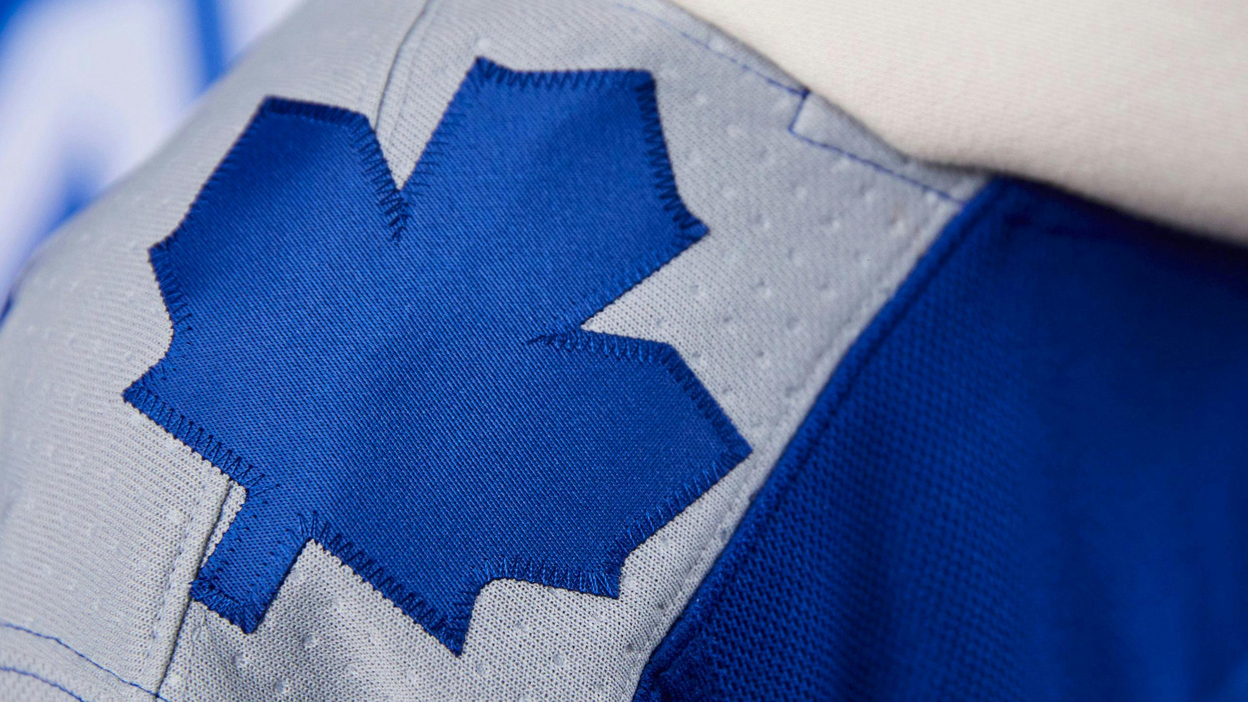
Look, I don’t think it’s the worst as many people are describing it to be. But, it could definitely be improved. Particularly either making that specific logo smaller, or changing it to the modern logo, as well as fixing that massive stripe at the bottom of the jersey.
That said, I give a lot more respect to the Leafs for trying something new with the grey colour, and I don’t hate the blue on blue with the logo and the numbering (although using different shades is a bit much). It’s a mess, but it’s different.
And I’ll probably end up buying one after they play a fun game in it anyways.
24. Nashville Predators
Like, I get that this is supposed to be a Reverse Retro of their navy blue jerseys from the 00’s, but honestly, it just looks like a restyling of their current jersey. Solid look, but doesn’t really do much for me.
23. Dallas Stars
After people complained a few weeks ago about not bringing back the old Stars logo, they finally brought back the old Stars logo, and I’d be excited, except the basically all white look (especially with the pants) is just meh. I’d rather just buy an old-school Stars jersey.
Pretty Good
22. Edmonton Oilers
I don’t know what it is, I just like how the orange pops out in this one. Hopefully the orange shoulders show that they’re going to get rid of the primarily orange jerseys, but I’m not holding my breath.
21. Vegas Golden Knights
I respect that Vegas is just making outlandish jerseys, and I honestly have no problem with. And honestly, this jersey really fits with the retro vibe, making me feel nostalgic for the good ol’ days, 2017.
20. Philadelphia Flyers
They aren’t bad, but they don’t really move me either. Pulls off the Reverse Retro theme very well, but ends up looking like one of their usual jerseys.
19. Pittsburgh Penguins
Would’ve loved to see them try with the older Penguins logo, but I get that it wouldn’t have really been much of a difference from their current ones since they have the same colour scheme. That said, still a good jersey, it’ll be nice to see it back in their repertoire.
18. Washington Capitals
The eagle logo might be my favourite of theirs, and the fact that they can use it without reminding of that dark period where their jerseys weren’t red, blue, and white makes me a happy man.
17. Buffalo Sabres
I was excited to see the old school buffalo logo make a return with the royal blue and yellow colour scheme, but I think going with the sabres as the main logo is a huge detractor here.
16. San Jose Sharks
Not many teams can pull off using grey as a primary, but it definitely works for the sharks, especially since they’re using the retro logo.
15. Boston Bruins
On one hand, I love the retro all-yellow look with the modern logo, and think it makes for a really good look. But, it loses points for having this.

14. Carolina Hurricanes
If they really wanted to have fun, they should’ve made it blue with green stripes, but I’m always down for more Whalers stuff. Some people don’t like relocated teams using jerseys from their older teams, but I have no problem with it.
13. St. Louis Blues
As ugly as this jersey is, I like the changeup to use red in this one. Fits with the theme without taking away from the overall appeal and aesthetic of the jersey.
Disgusting (the compliment)
12. Ottawa Senators
While this doesn’t entirely feel like a remix for me, it’s still a different look for them, and it reminded me that they’re using the old Sens logo again.
11. Columbus Blue Jackets
For a team with not much of a history, particularly with jerseys, this gets big points for somehow being creative, and finally giving the Blue Jackets a new primary colour other than that boring navy blue they have on every jersey.
10. Florida Panthers
I will never say no to the old Panthers logo.
9. Minnesota Wild
Love the blending of the current Minnesota team with the North Star colour scheme, even though it does look like it’s sponsored by Subway.
8. Anaheim Ducks
These jerseys are super ugly, but ugly doesn’t mean it’s bad. While the reversal could’ve been improved by making it eggplant with the green stripes, it’s honestly just going to be fun seeing these on the ice again.
7. Arizona Coyotes
Now THIS is a Reverse Retro. The Coyotes continue to embrace the amazing kachina jerseys, and bring out a new main colour with the primary being purple. Big fan, hope this is something they continue to use in the future.
6. Colorado Avalanche
Yup. Yup. Yup. The definition of a Reverse Retro right here. Taking the colour scheme of your current franchise and tying it in with the Nordiques is a win (although an Avalanche jersey in Nordiques colours could be interesting as well).
5. New Jersey Devils
The Christmas jerseys have always been my favourite of theirs, so switching it up and having the green as the primary was an excellent choice (although going all black with red stripes wouldn’t have been a bad move either).
4. Tampa Bay Lightning
I’ve always loved the retro logo, and it works just as well with their modern blue colour scheme. I’d complain that the colour scheme is a Leafs rip off, but I don’t think the Leafs are in any spot to complain right now.
3. Calgary Flames
I almost had to make an unranked category specifically because these jerseys aren’t remixed in the slightest, but they still look spectacular. Huge Blasty fan, wish he was used more.
2. Montreal Canadiens
A team that has had the exact same jersey for their existence finally changes it up, and it works. Love using the blue as a primary colour finally, and honestly, it’s just a great change of pace that I am here for.
1. Los Angeles Lakers… er, I mean Kings
Yeah, there was never any doubt with this one. The fact that they took my favourite black Kings jersey style, and gave it the purple and gold treatment is everything for me. Will definitely be getting one of these with Byfield on it.
Recent articles from Scott Maxwell
