logo

Ranking the 2022-23 NHL Reverse Retro jerseys from worst to best
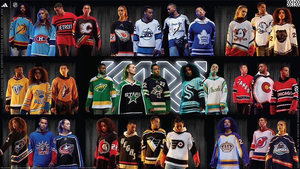
alt
Photo credit:NHL
Nick Barden
1 year ago
The NHL and Adidas revealed the Reverse Retros 2.0 on Wednesday and let’s just say they look a lot better than the first series of jerseys.
Don’t get me wrong, there were a bunch from the first batch that looked good, like LA, Anaheim, and even Arizona. But aside from that, I didn’t find many of the jerseys appealing.
This year, I would say 95% of the Reverse Retros are something I’d be okay with wearing in public.
Yeah, the first editions were that bad.
One of my favourite things to do when a long list of jerseys come out is to rank them from worst to best. And yes, that’s what I’m going to be doing right now. So, warm up your coffee, get your popcorn for breakfast, and let’s rate rank these jerseys!

32nd – Chicago Blackhawks

This is the worst. It’s boring. There are both thin and wide stripes which I, personally, hate. And it just says “Chicago.” They should try again.

31st – Detroit Red Wings

Detroit has pretty much the same jersey as Chicago. It’s just the stripes are in different places. Again, boring.

30th – Philadelphia Flyers

First of all, I’m not a fan of the sleeves on this jersey. It goes from black to white in an awkward place along the arm. Aside from that, it’s just plain as can be. It’s like Adidas and the NHL forgot to add spice to the jersey.

29th – Pittsburgh Penguins

Don’t get me wrong, there’s a lot of history behind this Penguins logo. But for some reason, I’m just not a fan of it. Pittsburgh has had too many black, white, and gold jerseys. They need to change things up a little bit.

28th – Seattle Kraken

I love the colours, however, I hate how there’s all different types of stripes, especially along the bottom of the jersey. It’s so difficult for Seattle to make something because of how new they are to the league. They’re placed in 28th because of that, unfortunately.

27th – Carolina Hurricanes

This is literally Carolina’s road jerseys, but reversed. It’s just reverse and they forgot the retro. In all seriousness, I think Adidas, the NHL, and the Hurricanes could’ve gotten a little bit more creative. Because again, it’s pretty much their away jersey but reversed.

26th – New York Rangers

I’m a huge fan of this jersey. It gives me flashbacks to Marek Malik’s between the legs shootout goal against the Washington Capitals back in 2006. The only thing I don’t like about this jersey is the long red stripe along the sleeves. If they went with a smaller stripe, I guarantee this would’ve been closer to number one.

25th – New Jersey Devils

This just looks like their away jersey, honestly. I don’t mind the blue, red, and gold, but it’s just not eye-popping to me. It’s bland. It needs some lamb sauce. I wonder if Gordon Ramsay has any.

24th – Calgary Flames

I can see what Calgary is trying to do here and I respect it. I love when people try something out of the ordinary. This, though, looks a little bit odd. A little bit. I like that they tried, but I think they could’ve gone a different way. Again, I respect it.

23rd – Winnipeg Jets

The more I look at the colours on this jersey, the more I start to dislike them. The blue stripes are way too big. The Jets logo is just, well, the Jets logo. I would’ve liked it if they went with the ‘Winnipeg’ underneath the ‘Jets’, similar to their alternate.
But they didn’t and that hurt them in my rankings.

22nd – Columbus Blue Jackets

A lot of people hate this jersey, but I’m not one of those people. I kind of like the sleeves, the colours go together seemingly well, and the stars along the arms don’t look as bad as some might think. I believe I’m in the minority here, but again, it ain’t that bad.
Maybe I like it because people hate it. Who knows.

21st – Minnesota Wild

Give me the Minnesota North Stars, why did Adidas never re-make them? I don’t want the home version of their last Reverse Retro jersey. This is a miss by Minnesota and I’m now contemplating placing them in 30th.
I won’t, but only because I like the colours of this jersey.

20th – Edmonton Oilers

I’m a big fan of the asteroid, if that’s in fact what it is. *Does some research*. Oh, it’s an oil drop. Okay. Interesting. Anyways, I love the colours of this jersey but for some reason I still don’t like it as much as the others in front of it.
Maybe just because it’s so dark. I don’t know, I just am not a huge fan of it.

19th – Washington Capitals

This brings me back to Alex Ovechkin’s goal against Arizona — the best goal ever scored, in my opinion. I love the eagle and the nostalgia behind the jersey just makes it 10x better. To be honest, though, I would’ve liked to have seen Washington step out of the box a bit more.
But they didn’t.

18th – Nashville Predators

The only reason as to why this jersey isn’t ranked closer to #1 is because of the word ‘Nashville’ on top of the saber-toothed tiger. I’m picky and I hate myself for it. P.S. to the NHL, Adidas, and the Predators; stop putting words on the front of your jersey. They don’t work.
Smashville should’ve been the first, and the last.

17th – Ottawa Senators

I will be sending the same message to Ottawa as I did to Calgary. I see what you did here and I respect it. The Senators seemed to be able to pull it off a bit more. I’m also a big fan of the sleeves and the numbers.
It looks similar to all of Ottawa’s other jerseys, though it has just a bit of difference where I like it.

16th – Montreal Canadiens

The colours on this jersey are immaculate. I would’ve liked to have seen more personality in this jersey, though. It looks like a Montreal home or away jersey, just with two shades of blue and no red. I still like it, but a little bit more spice would’ve been appreciated.

15th – Colorado Avalanche

I’m a big fan of this jersey. Everything about it is just perfection, honestly. My only gripe with it is that there’s not much personality to it. Most of the jersey is white, and while I usually like that, I don’t for this one. It kind of gives me Atlanta Thrashers vibes, though.
Ah, we should’ve gotten a Thrashers jersey from Winnipeg.

14th – Dallas Stars

The old Dallas Stars logo. I think I’m in love again. Give me different sleeves and this jersey is easily in my top-five. For now, though, it stays in the top-15.

13th – Toronto Maple Leafs

I hate to do this, but I’ve got to put the Maple Leafs in 13th. I get what Toronto is trying to do here, but it just looks like their home jersey with a few alterations. I will say, though, that it’s much better than their last Reverse Retro. 100 times better, probably.
The stems on the Maple Leafs logo put it over the top for me.

12th – Vancouver Canucks

I love the Canuck. I love the colours. I love the number on the front of the jersey, even though it’ll be weird for Bo Horvat with the ‘C’ and the jersey ad. If you change the green on the end of the sleeves, and maybe make it a white jersey, I’d say it could easily be top-three.
This one continues to grow on me, though.

11th – New York Islanders

The fisherman is back! I love the stripes on both the arms and waist. It’s different and enjoy that. This jersey should definitely be in the top ten — maybe even top five — but there are so many other good jerseys, so this one has to be in 11th place.
It’s unfortunate.

10th – Boston Bruins

Bear in mind, this was a hard decision to make, am I right? This jersey — similar to the Islanders’ one — could have been much higher on the list. The colours and the spiked stripes take this sweater to another level. It’s unique.
I know for a fact that this’ll be higher on the list once I see it in-person.

9th – San Jose Sharks

California Golden Seals meets San Jose Sharks. I love it. This is the definition of Reverse Retro. Having to put this jersey so far down the list sucks, but it’s the reality of the situation. The gold, white, and teal blend together beautifully.
I, personally, would spend money to buy this jersey. It’s very well done.

8th – Los Angeles Kings

The closer I get to the number one spot, the less I have to say about each jersey. This one, in particular, gives me that LA vibe as this sweater shares the same colours as the L.A. Lakers.  The crown tops it all off.
But somehow, it still ends up in 8th place.

7th – Anaheim Ducks

I’m pretty sure anytime you slap the Mighty Duck onto a jersey it automatically makes it a good one. I like the colours and it sort of brings in the new gold that Anaheim has on the ‘D’ logo of their home and away jerseys.
Subtle but sweet. Not too shabby.

6th – Buffalo Sabres

This takes me back to the Jason Pominville and Thomas Vanek days. I love this Buffalo logo, I love the shades of gold and blue that they went with, and the diagonal wide stripes are interesting too.
It seems to all flow together perfectly and I have nothing else to say other than that. I would buy this jersey, too.

5th – Arizona Coyotes

Five to one is the hardest to rank. This Arizona jersey would’ve been ranked closer to first if it didn’t look similar to their last Reverse Retro. I get it, it’s supposed to be reversed, so I let this one slide. Aside from that one problem, this is an incredible jersey.
The colours, the story, all of it. I hate myself for not putting it closer to first.

4th – Tampa Bay Lightning

This jersey is all over the place and I love it for that. The lightning strikes along the arms are so cool and the waves along the waist tie everything together perfectly. It’s the perfect way to summarize the city of Tampa Bay and the word ‘Lightning’.
It’s also different and I’m all for that.

🥉 – Vegas Golden Knights

Full disclosure: I had this jersey in the top-20 before I found out it glows in the dark. Yes, you heard that right, it glows in the dark.
I love it. I love it. I love it. Even if it didn’t glow in the dark, it’s still a nice-looking Reverse Retro for a team that has only been in the league for five years.

🥈 – Florida Panthers

This came out of no where and I have to say, it’s so beautiful. The palm trees, the sun, the hockey stick, it feels like I’m in the heat right now. I mean, I technically am in the heat right now in my own home. But the sun is just so much better.
Anyways, the colours go perfectly together and it’s just so different from any other Panthers jersey. I love it.

🥇 – St. Louis Blues

Winner, winner, chicken dinner. The St. Louis Blues take number one spot with an amazing-looking jersey. I knew right when I saw this for the first time that it was the best Reverse Retro sweater.
I love the music note, I really love the ‘St. Louis Blues’ text, and the colours with the thin stripes allow everything to flow perfectly.
The long stripes on the wrist, again are a no-no, but for this jersey I’m making an exception. This is an incredible sweater, and to me, maybe one of the best in the NHL, ever. Hot take, I know, but it’s that good.
I am buying this jersey yesterday.

Check out these posts...