What will the Leafs reverse retro jersey look like?

By Jon Steitzer
3 years agoThere are few times the NHL gets something right. The early days of the Winter Classic, the bubble approach to the Return to Play this summer, and now we might be able to add fun jerseys to that list. The teases and leaks we’ve seen from other teams so far have been encouraging, but that leaves us with an important question, what will be done for the Leafs?
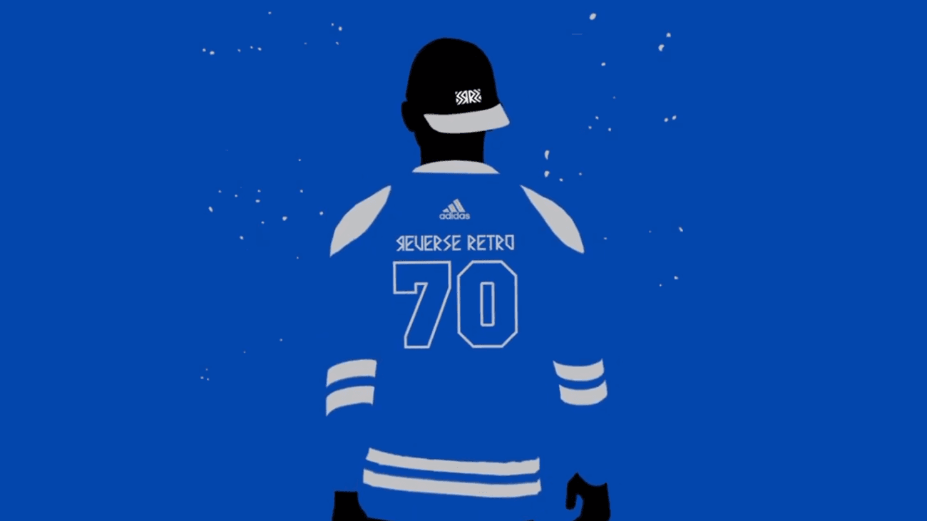
Based on the image above, we can assume two things.
- It will be based on the 1970 jersey design.
- It will be blue, with either white or grey accents.
The first is appealing because the Leafs haven’t done much with the Ballard era jersey design, likely because of its connection to the Ballard era. The second, at least for me is decidedly less appealing since it’s the same colour scheme we’ve had since the beginning of time. It might not exactly lend itself to a fun design.

Rather than focus too much on what it will probably look like, we’ve asked the writers of The Leafs Nation to tell us what they want the Leafs reverse retro jersey to look like. Remember to tell us who got it right in the comments.
Michael Mazzei
The alternate jersey the Leafs used from 2011 to 2016 would be my pick for their Reverse Retro design. I’ve always been a fan of it and thought they should have continued to wear it beyond the 2015-16 season. It may represent a low point in the team’s history from the past decade, but I have found memories of Jake Gardiner scoring the first Leafs playoff home goal in that sweater, as well as the Game 6 win back in 2013. I know it’s a long shot, but they should bring it back and I hope it’s as their Reverse Retro.

Mark Norman
I would love to see a color-swap of the alternate jersey they used from 2000-07. I have very fond memories of Sundin, Tucker, Roberts, Kaberle wearing this jersey, which was also the last time we were making playoff progress. It would be similar to our current blue home jerseys, but with white shoulders and the TML logo patch on the shoulders. I’d leave the current logo alone. Maybe it comes with two horizontal stripes on the torso, rather than the current one? I would buy this jersey in an instant.
Scott Maxwell
So, here’s the biggest problem with the Reverse Retro jerseys for the Leafs. They have consistently been a one colour team (I’m not counting white because it’s the away jersey colour for every team, and it’s also a shade), which means that they can’t actually make a Reverse Retro jersey, because if you reverse any blue jersey, it just becomes the away version of that jersey, and if you reverse any white jersey, it just becomes the home version of that jersey.
Which is why there is only one clear answer, and that is the original Toronto St. Pats jerseys.

Imagine these bad boys, but brown with green stripes, and white pants. They’d be super ugly and I’d honestly love every minute of it. It’ll never happen, especially considering the curse that goes with them, but it’s technically the only way the Leafs can do a Reverse Retro without it being a home/road version of an existing home/road jersey, or adding a colour that the Leafs have never used
Jon Steitzer
I’ve had many of issues with the Leafs jerseys and colour scheme for a number of years, and will once again hop back on my BS about it. The Leafs jerseys and logo are boring and while they are traditional, they don’t exactly lend themselves to exciting reinvention. Introduction of grey or silver at times is all we’ve had for fun, and the St. Pats jersey, which is also pretty bland with a wordmark on it, is what passes for fun around here. Let’s spice things up will sticking with tradition.
With that, I bring you the FRANKENJERSEY

Gross, right? (Also graphic design is clearly my passion.)
What we have here is the Ballard era jersey template, complete with the 11 point Leaf arm patches. I’ve used green for the St. Pats, and rather than the usual “Toronto Maple Leafs” in the current Leafs logo, I’ve opted for the Arenas era “T”. I’ve managed to bastardized four jerseys at the same time and feel like that’s right in the spirit of this reverse retro design.
The fact that these have a Hartford Whalers vibe to them is a bonus, and frankly if there is the option to wear copperalls as part of this reverse retro program, I think the Leafs should take full advantage of that.
Now dialing this back around to reality, I think the green jersey isn’t going to happen, so if we swap it to blue, and have shamrock shoulder patches to give nod to the St. Pats era instead, I think we might be looking at a less offensive version of this.
Marsha Joseph
My guess is the team doesn’t actually reverse, but throw in a whole new colour on a retro jersey. The down side to the Leafs is the extreme lack of colour in their history. Royal blue is so boring when that’s all you got.
I’d love to see the 28-33 jersey with a light blue, and either the current logo or some spin off of the one on that jersey. Maybe one remenecent of the Next Gen promotional blue. I love the stripes on it and I think it has the potential to look amazing.
Nick Barden
Just make it a nice looking jersey.
Editor’s Note: Spoken like someone ready to buy a second Marincin jersey.
Recent articles from Jon Steitzer