The Top 5 Jerseys in Toronto Maple Leafs History

6 years ago
Later tonight, Adidas and the NHL will be revealing the uniforms of all 31 teams for next season. The Toronto Maple Leafs, who are one of just two teams to not release a teaser of the new threads on digital media, are not expected to change much; at most losing the laces on the collar or slightly tweaking the font in compliance with Adidas’ new technology/jersey shape.
While we wait, though, here are my five picks for the best jerseys the team has ever worn.
5. 1927-1934
We’ll start from the beginning; worn most recently just a few years ago for the 2014 Winter Classic. Toronto made a jarring departure from being the Green and White St. Pats to the Blue and White Maple Leafs near the end of the 1920’s, and while it’s a little too busy along the arms for today’s game, it’s got a classic, old-time look that stacked up with their peers at the time. The only bad thing they ever did with this uniform before switching it was changing to a traced-white number font for a few years; that decision brought the jersey from Top 5 to Bottom 5 temporarily.
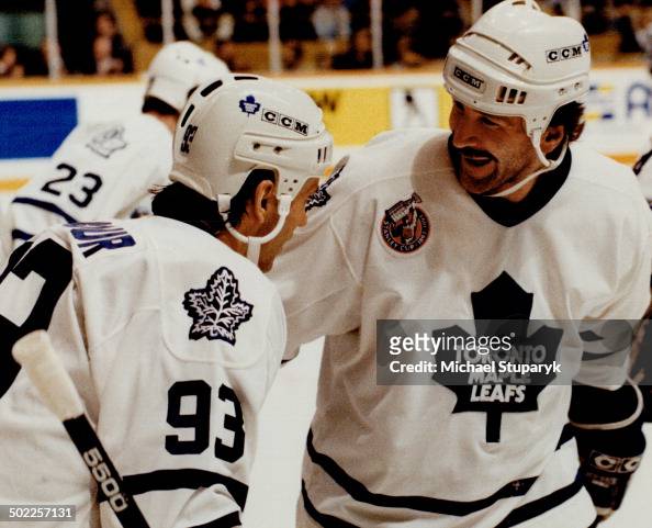
4. 1972-1992
Now that it’s gone, we can probably say with certainty that the “Ballard Logo” is the worst Leafs logo. Fit its time, sure, but the weird curves of the Leaf and the Art Deco font just weren’t fitting of an Original Six franchise. With that said, the opposite colour shoulders were a really nice touch and gave these jerseys some shelf life. I’ve long wanted to buy a Randy Carlyle or Ron Wilson sweater in this design, if only for the laughs.
3. 1993-1997, 2011-2016
That said, the look started to wear itself thin after a bit, so the Leafs went with something a bit more traditional for a few years. The logo remained and would for nearly another 25 years, but the simplified striping and the old-school Leaf on the shoulder patch signified a team that was maturing in more ways than one in the early 90s. The Leafs would eventually re-modernize the fonts to match the crest, which was a bit of a shame but came to their senses again years later.
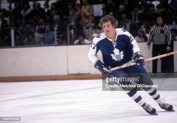
2. 1967-1971

These jerseys somehow simultaneously were the wrong decision yet among the best ever. The Leafs switched to them midway through the 1967 season to celebrate Canada’s Centennial, won their last Stanley Cup in them, and held onto them for four more years before going to the Ballard logo.
1. 1963-1967

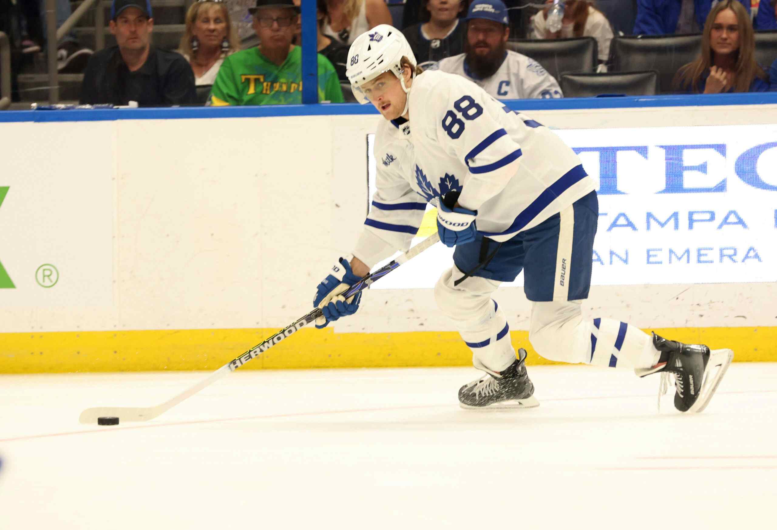
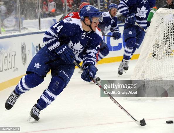
But nothing beats the ones just before them. The 35-point Leaf was dignified and stuck around for longer than any pre-expansion Leafs emblem. The uniform had subtle, basic striping and the shoulder yoke on the whites looked fantastic. The Leafs have inched closer to this look with their current uniforms, whose bottom stripe disappointed me last year but I’ve grown to like, but are still a few refinements away from fully getting to their best ever identity. Toronto also used the white version of the design for large chunks of the late 90s and 2000s, particularly come playoff time.
Recent articles from Jeff Veillette