
Ranking the Maple Leafs’ alternate jerseys from worst to best

By Nick Barden
2 years agoEvery year, the Maple Leafs have a special event where they add a new jersey to their collection. Or they get us to add a new jersey to our collection.
This season, Toronto was more than happy to give us a few new jerseys, including one for the Stadium Series, and possibly two more?
We’ve all seen the one that Justin Bieber was wearing in a photo on Martha Stewarts Instagram page, which is rumoured to be the Maple Leafs’ Next Generation Game jersey.
But I want to pose this question to you — which one’s are the best?
Throughout this article, I’m going to look at the most recent special events jerseys (from 2014 to now) and I’m going to rank them from worst to best, plus why I think that.
7. 2021 Reverse Retro jersey

I really don’t need to say it since it’s been said thousands of times already, but the Maple Leafs swung big and missed on this one.
I’ll be honest, when I first saw it, I thought it looked like a jersey that you could buy from Wal-Mart. I’m not joking. The jersey has its flaws in two places for me — the grey, everywhere and the maple leaf itself.
For a majority of people, I’d say that if the grey was switched to white it would make this a much more likeable jersey. In terms of the maple leaf, I’m just not a fan of it. I think it’s way too big for the jersey. So big that the captain’s ‘C’ is all the way in the corner.
Now that I’m looking at it more, I do also want to mention that the numbers suck when they’re that close to the elbows.
My rating for this jersey is a 3/10, maybe even a 2.
6. 2017 Next Century Game jersey

I unfortunately have to say this, but Toronto’s Next Century Game jersey is my second least favourite. (I changed my mind after looking at the Reverse Retro’s for too long.)
While I love the neck band and the front of the jersey itself, the arms ruin it for me. There are way too many stripes on the arms and it just doesn’t look good. I will say that one to three bands is great, but once you start going over that it just doesn’t work.
The one thing I will give the Maple Leafs credit for is bringing more whites into the blue jersey. When white is mixed well with blue, it makes the jersey look so much better. But when you start putting in a lot of white with the blue, it takes away from the main parts of the jersey.
I’d rank this jersey a 5/10.
5. 2017 Centennial Classic jersey

I’m definitely going to get hated on for this one.
I’ve never really known why I don’t like this jersey. Maybe it’s the fact that this photo of it makes them look five times better than they do in person, but I just don’t enjoy them at all.
The biggest part of the jersey that I’m not a fan of is the large stripe down the middle. It looks nice with the silver outline, but even with it, I’m not enjoying it as much as many people.
My rating for this jersey is a 6.5/10.
4. 2022 Heritage Classic jersey

I’ll admit, this jersey is continuing to grow on me, bit by bit.
When it was released, I was very disappointed. The video for the jersey was very well edited and got me excited for what was to come, until my hopes were let down.
The best part of the jersey is the navy blue, by far. As much as I like the Maple Leafs’ regular blue, this navy takes the colour to another level.
There’s plenty to like about the jersey, but the two parts that sway me to the other side are the fact that there’s no stripes on the arms, and the (also navy blue) ‘ARENAS’. I would’ve liked it if there was just a ‘T’, but for some reason, they had to put the ‘ARENAS’ word in there.
I get it, it’s an old jersey, so you’ve got to include it. I do think, though, that if they added arm stripes, many more people would be lined up to buy this.
This jersey gets a 7.5/10 rating from me.
3. 2014 Winter Classic jersey

I love these jerseys a lot, in person.
There’s not many reasons not to like this jersey. There’s a white neck and shoulder plate, the perfect amount of stripes on the arms, and even some stripes on the bottom half of the jersey. Along with one of my favourite Maple Leafs logos in the middle, it’s a great jersey.
I’m not too sure if there’s anything I dislike about the jersey, but the reason it’s not in the top-two is because there’s jerseys that are somehow better.
This jersey gets a rating of 8/10.
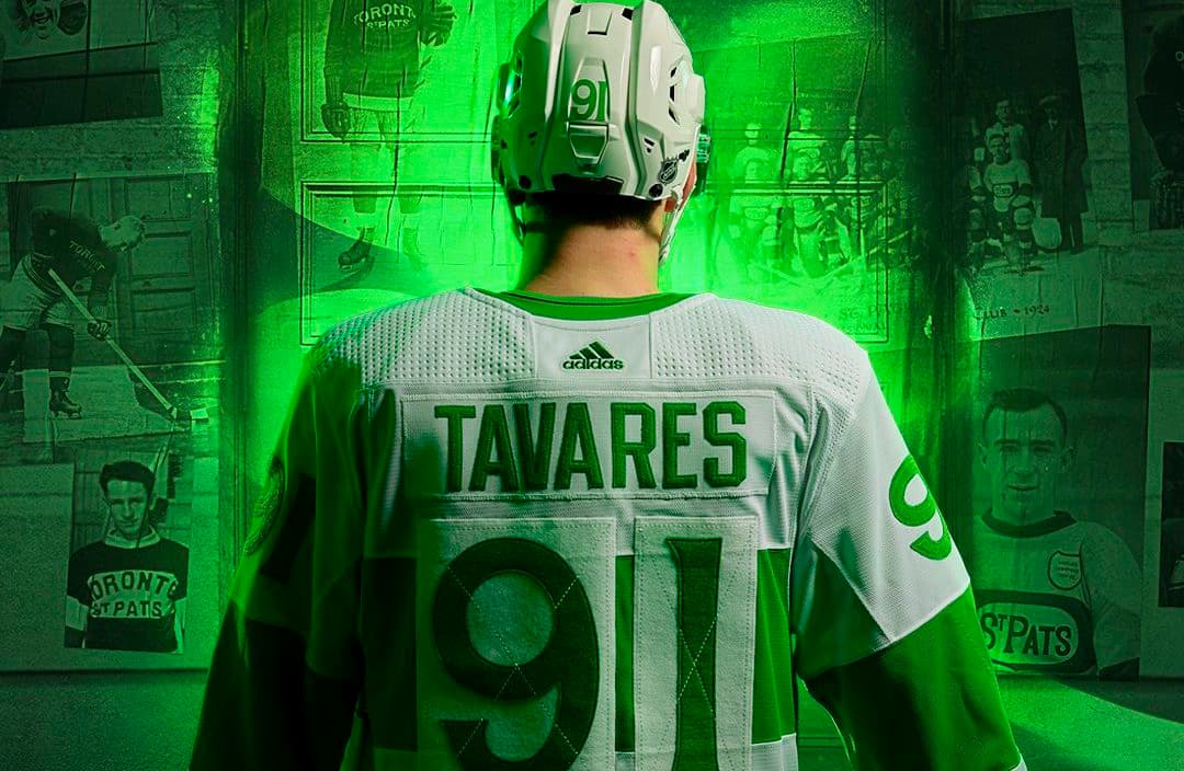
2. St. Patrick’s Day jersey

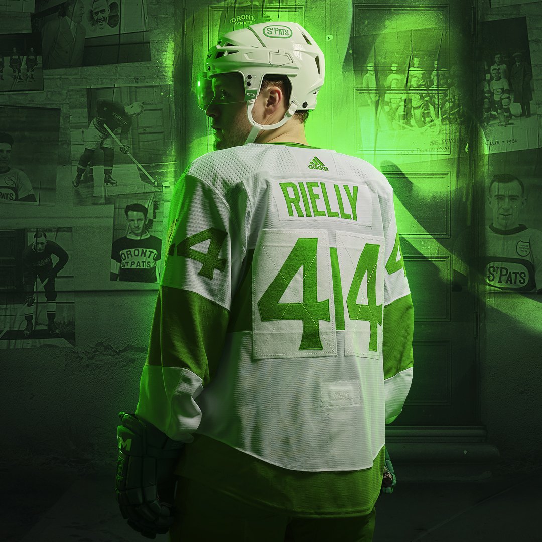
Toronto’s St. Pats jerseys don’t miss.
I love every single little part of this jersey. The St Pats logo, the number plates on the back, the green that’s used — I love it all.
There’s no one part of this jersey that I think can be changed to be made better. Well done MLSE.
I rate this jersey a 9/10.
1. 2018 Stadium Series jersey

I know I’m probably alone with this as my favourite jersey, but in all honesty, it rules.
The white on white on white, which I know many aren’t a fan of, just goes together so nicely. The numbers on the shoulders, the different coloured stripe down the middle, the ‘HONOUR. PRIDE. COURAGE.’ on the arm band — it’s all perfect.
One little detail that I didn’t know about prior to writing this article is the dark shade around the players’ name plate on the back. It rules. All of it.
I was thinking of giving this a 9.5/10 rating, but after looking at it again closely, it has to be a 10/10. I’m sorry, but white jerseys rule.
Looking ahead to the future now, I’m really excited for the Next Generation jerseys. It’s going to something really different and I hope they get it right. Hopefully it’s designed by the Next Generation too.
This, though, is my Maple Leafs ‘special games’ jersey rankings. I’m sure a lot of people disagree with me on a bunch of these ratings, but hey, that’s the fun of NHL jerseys, and hockey in general.
If you’d like, put a comment down below on your rankings for these special event jerseys!
More from THELEAFSNATION
Recent articles from Nick Barden


